Designing & Planning the Henry Krank Website - From Ideation to Implementation
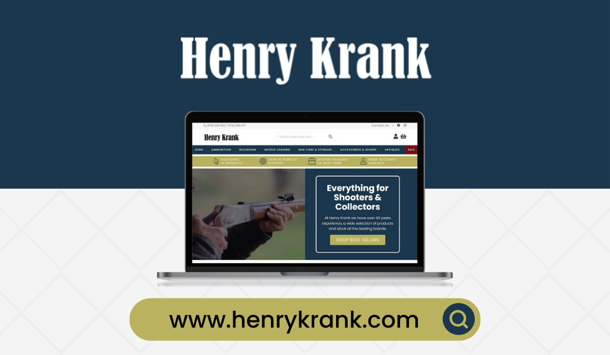
The previous Henry Krank & Co website was the one I cut my teeth on when I first joined the company in early 2019, at the time it was fairly new and I was initially tasked with fixing errors in data migration and general upkeep of the site. As the business rapidly evolved, so too did the expectations and requirements we had of our online presence, chief of which was our website. Despite the shooting industry still being quite traditional in the way some things are approached and prone to rejecting modernity in favour of tried and true traditionalism, it was decided that we had to drop certain aspects of how we did business and marketing regardless of this (including discontinuing the Henry Krank catalogue which had been a staple for decades), leading us to start tentative discussions on planning a completely new website with expanded features and a more modern look. As the main point of contact for this project,
Planning & Research
Due to the deprecation of Magento 1 as well as the ongoing small (but still bothersome) issues that had started to plague the site in recent times, we had decided to finally start the planning of a new website in earnest. One of the major factors of instigating this was the list of new features and plug-ins we had gathered with the intention to have implemented, due to the support for Magento 1 being phased out, it didn’t make sense to integrate any new services or features into our existing website since we would need to migrate to Magento 2 sooner rather than later regardless.
As we ran a custom EPOS system inhouse, we needed to contract developers who would be able to quickly get familiar with our operating procedures and how data is pushed to the website from our customised systems. Also something to consider was the fact that the industry we are in is quite different to your average retail space, the sale of firearms, ammunition, and powder is naturally tightly controlled and requires for certain hoops to be jumped through. Many items we sell can only be ordered over the phone and require licences to be sent in, other items can be ordered on online but can also come with caveats (deactivated firearm sales now have to be reported to the Home Office, for example). Fortunately, there was already a development company (Piranha Digital) that had worked on websites for other clients that used the same EPOS system as us, making them the ideal choice for us when it came to recruiting a team to help us bring our new site ideas to fruition.
We went through multiple meetings to ensure both parties were on the same page with regards to what our needs were, how we planned on overcoming particular quirks of our systems and business, the costings and timeframes, and the priorities of various tasks and features due to be implemented. We were not immune to the struggles of the Covid-19 pandemic and the fallout from it, this added an extra layer of complexity and would also interefere with our timescales due to absences and changes in working policies.
Despite any hiccups along the way, the development team had finally been organised, and it was time to start drafting ideas to be put forward for consideration and initial development work. As a starting point, the team at Piranha gave us a very rough “blocking out” of how they envisioned the website could look, taking cues from our existing site as well as some comments from preliminary video call meetings we had with them previously. From the start, we also had to get clarifications on how our data and features were to be migrated from the old site to the new. Despite moving from Magento 1 to Magento 2, there were some things that we had to plan around unexpectedly or endeavour to do in a more manual way. Once we had the very fundamental foundations set, we got started with looking for inspiration to inform our design considerations.
The Design Process
By this point, we had an incredibly rough skeleton of a design plan and some tentative ideas on how certain features and data migrations were going to take place. I did some research into website designs that were likely to suit us the best, looking at what worked on our previous site and what I’d like to change this time around since we were starting again from scratch.
One of the considerations I gave scrutiny to early on was the mega menu that sits at the top of our website. Shooting is a very particular industry, and as such becomes a bit of a multi-headed beast when it comes to the categorisation and organisation of products. There was little getting around the fact that we still needed the same, or at least very similar categories and sub-categories (both in terms of naming and quantity) as our existing site. As a way of mitigating an overload of too dense information when browsing through categories, and to make the sub-categories look more visually appealing, it was decided that clicking on a parent category would direct the user to a landing page for that category which would display any sub-categories in a much more visual and graphic-led manner.
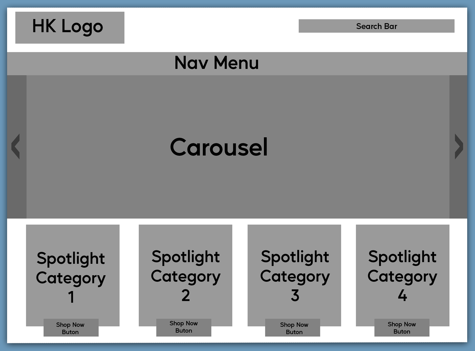
One of the main things the new website had to do was be quickly familiar and easy for customers to locate desired information and products. Many of our customers were on the older and sometimes perhaps less technologically inclined side, so intuitive use and clear information stood prominently atop our requirements list. Another consideration was that many of our customers preferred to browse our site through devices such as phones and tablets, this was a trend we’d noticed creeping up over the years (as many other ecommerce websites have of course). As a result of this, mobile responsiveness was a large part of how we designed our new website and informed many decisions on which elements to include on which pages, with a focus on testing how images and text scale down to smaller screens.
I’d often felt that mobile responsiveness on our old website left a lot to be desired, shortly after I joined the company I had already implemented many custom CSS fixes to ensure that the site header and navigation fit on smaller screens correctly, so it was a particular point of interest to me while working on our new website. Another major improvement I wished to implement moving forward was changes to the homepage, our existing website had a homepage that was far too busy and gave an overwhelimg sense of information overload, the vast majority of customers didn’t even click on certain page elements that were taking up a not insignificant amount of space on our homepage. Due to the amount of scrolling required, few customers ever bothered to scroll far enough down to reach the links and information we had contained in the footer.
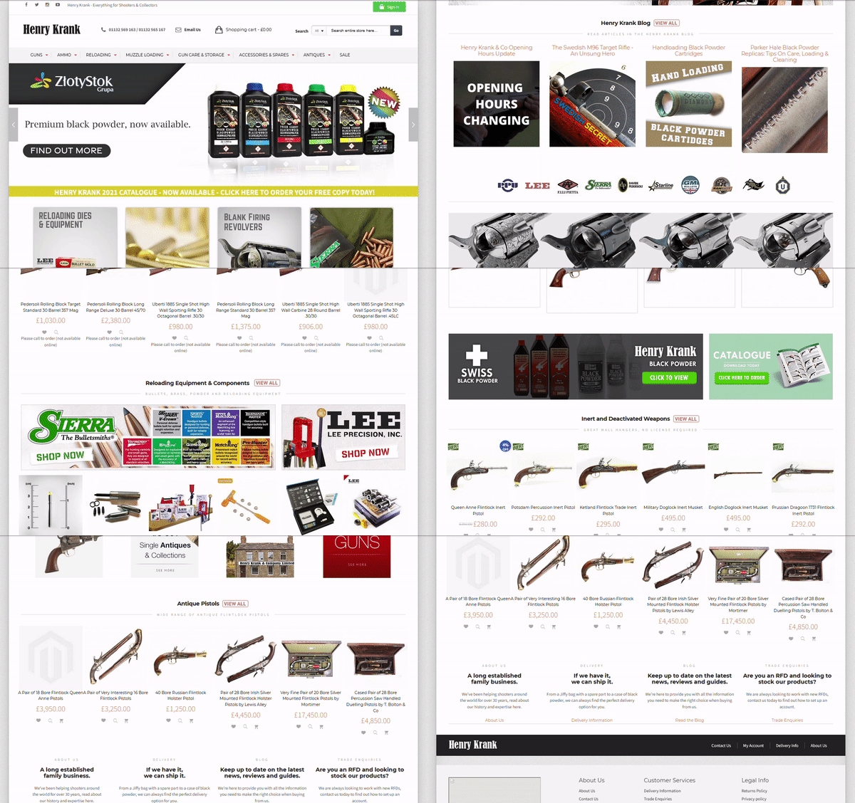
For the new site, it was paramount that we not only had a much cleaner and visually interesting homepage, but also one which was optimised to load its elements far quicker than our old site had done. We made a list of all ecommerce websites we had either used in the past or one we regularly frequented, and explored how they presented information on their pages, to see if there were any particular sparks brilliance we could use to aid our own designs. Websites such as the one for John Lewis in particular provided heavy inspiration for certain pages, as they had embraced a very clean but still informationally useful design throughout, something we too wanted to strive for. Finding the correct balance for such things absolutely proved to be easier said than done and took many iterations, as the last thing we wanted was to lean too far into form over function.
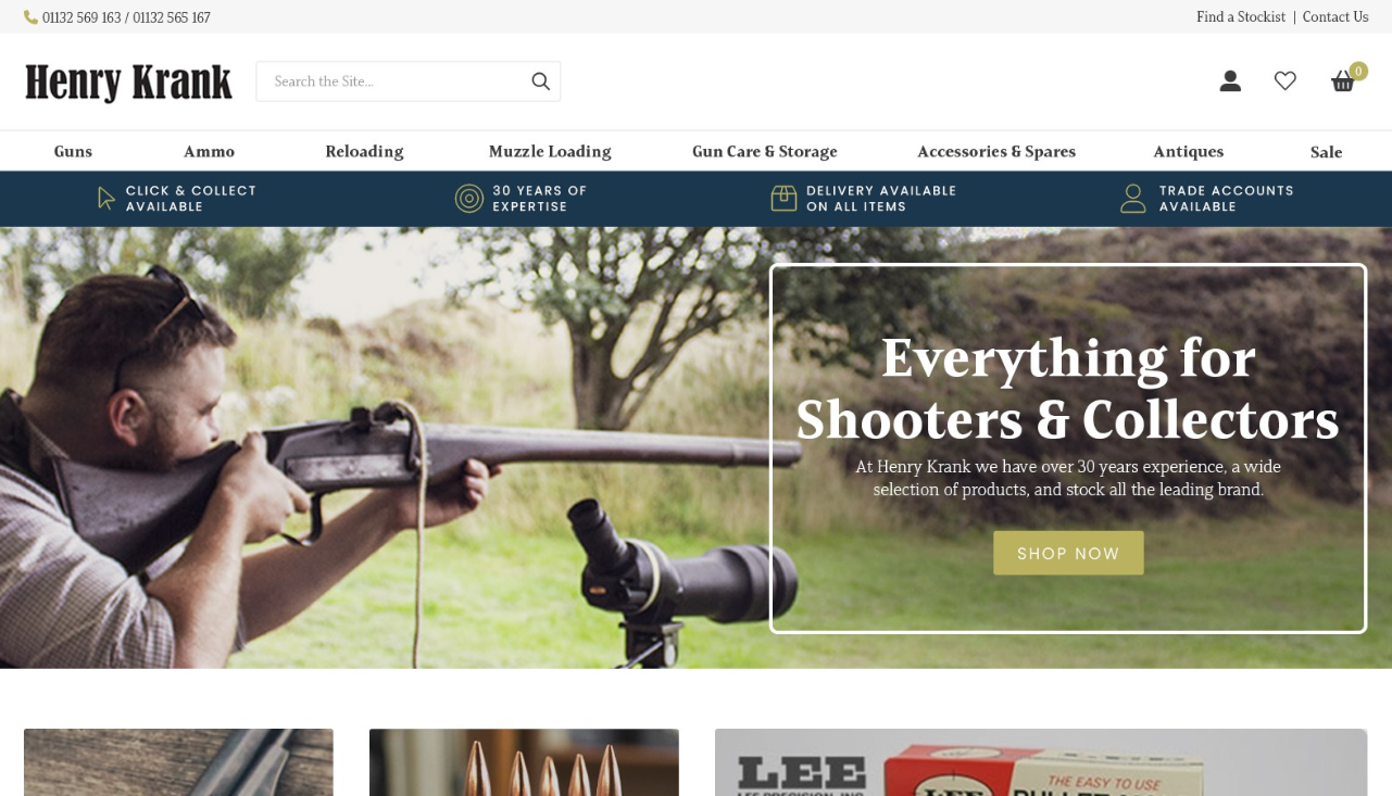
As we created various mock-ups and guidelines to send over to Piranha, the design of the site very slowly started to take on greater form. Plenty of our ideas that may have sounded good at the time or looked fine in our personal mock-ups didn’t necessarily transfer to the site as we’d hoped in practice, this iterative process took its time but eventually left us with a very solid base from which the development team could use to start implementing onto our demo site which we would use religiously moving forward for prototyping ideas.
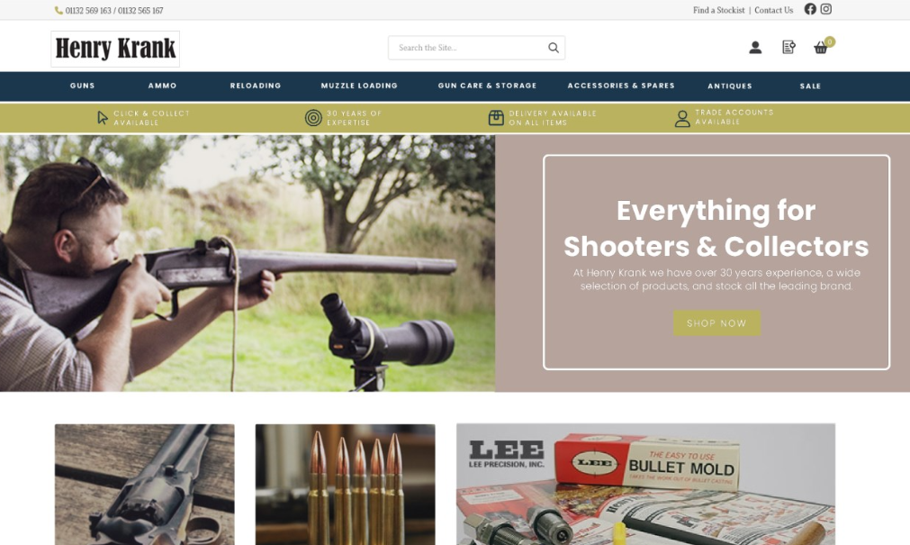
After all of the mood boards, meetings, e-commerce website trawling, research, and trial and error, we were finally in a position to work on functionality and general site content testing. We knew changes were still likely to take place when it came to the overall design and colour schemes of the site that we had conjured up so far, but at this point we had a great pallette and base to work from as we started to craft working prototypes of the new site.
Development Work Begins
Based on the extensive work carried out in the initial design phase of this project, the development team were able to construct us a Magento 2 instance on our demo site with clickable elements and rudimentary features.
In order to test the site with real data moving forward, I coordinated with the EPOS team to provide Piranha with a copy of our current database from the system that was feeding our existing Magento 1 website. There’s only so much “lorem ipsum” you can bear before yearning for real world workable data. This also gave us a better canvas with which to amend some of the choices we’d made in our design phase. For example, some blocks of products ended up formatting incorrectly due to the length of the descriptions of some products ranges, something we wouldn’t have considered until seeing our designs manifested with real product data.
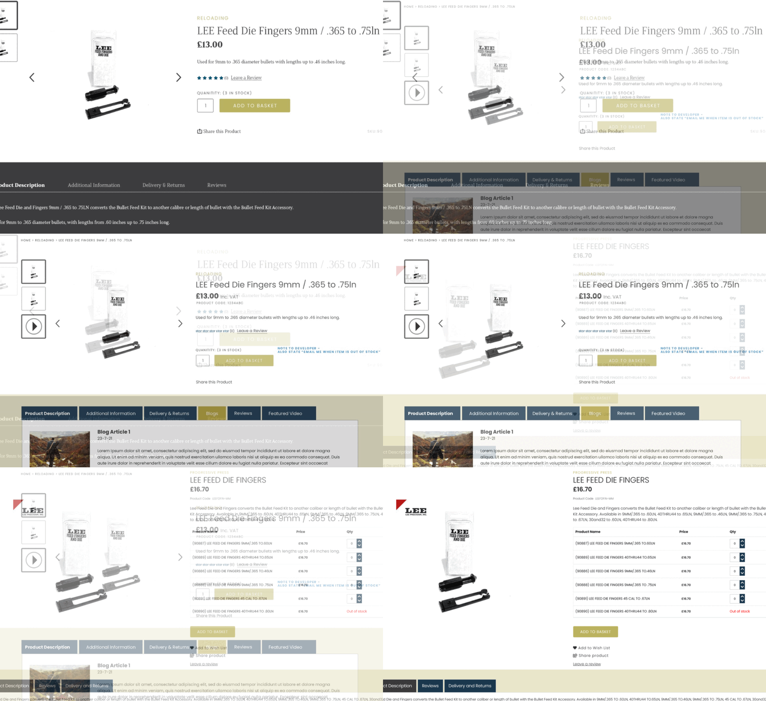
Coordination and communication in this phase was vital, incredibly frequent, and comprehensive. As the main point of contact for this project, I was tasked with not only testing completed work, but also coming up with suggestions to try in place of an idea that wasn’t working out, and then communicating that information to the relevant parties. This included much liaising between Eposlink and Piranha to ensure that everyone was on the same page with the current goals and troubleshooting tasks.
Fortunately, my fundamental knowledge of website development from university and hobby projects aided me with being able to communicate technical aspects and suggestions to the team efficiently, meaning we could cut down on some of the back and forth that may otherwise have been required in order to properly confer ideas and intent.
We kept track of work by utilising a shared Google Sheets document, with a clear legend and guidelines that indicated completed work, in progress work, and work which we had designated for amendment or query. This ended up working well and was an simple solution for our project management despite more tailored solutions being available. We still use this simple system today for allocating and tracking current development work on the website as it continuously evolves.
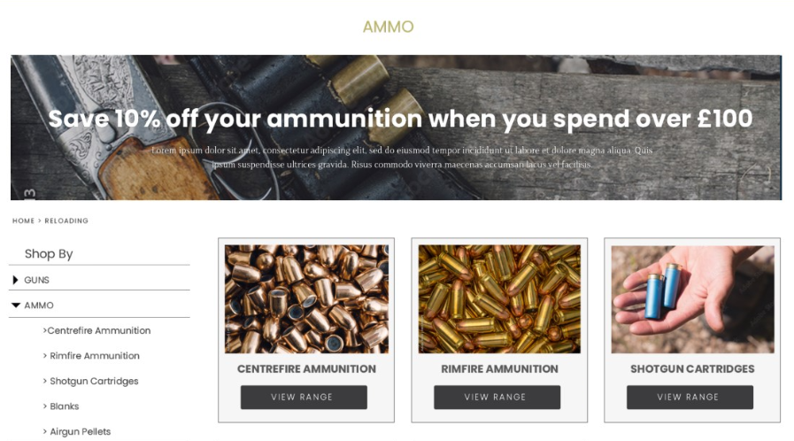
This phase was made up of many months of testing actioned items from our list and suggesting new points to add. We used a myriad of devices, screen sizes, different users, and software to test the website as we went along. Always asking ourselves questions along the lines of “if I was a customer who wanted this product and was using this device, how quickly could I find it what I needed?”. The last thing we wanted was a high bounce rate due to users experiencing frustrations with our brand new site when it launched, I’d spoken with enough customers on the phone who had experienced difficulties ordering on our old website that I wasn’t prepared to let that particular issue arise again.
After what felt like an eternity, all of the points on our to-do list had been actioned by Piranha and tested by us. The only thing left to do was perform our final sweep of the site before I could sign off on the work completed thus far. We’d gone through many changes, both large and also nitpicking-ly small, but we’d arrived at a point where the final thing to do was to fix a date and prepare for any potential issues and customer enquiries that may come our way.
Launch Day Arrives
In preparation for the launch, we’d assembled various marketing materials. These included social media posts, blog posts, emails, and all of the graphics needed to convey one simple fact - this is still the same Henry Krank you know, but now with a much better and easier to use website.
We decided to launch mid week, the reason for this being that Monday is always a busy day for us as we deal with orders and customer requests that have been placed over the weekend, and also that it was still early enough in the week for us to catch and encounter any particularly heinous bugs and issues while our developers were still in the office through the standard working week.
Whether it be due to our particularly protracted planning, design, and development periods, or that the fickle mistress of fate decided to actually smile upon us that day, we mercifully encountered no major issues at all on launch day. The switchover from old to new was seamless, and we barely had any customers contact us regarding the switchover.
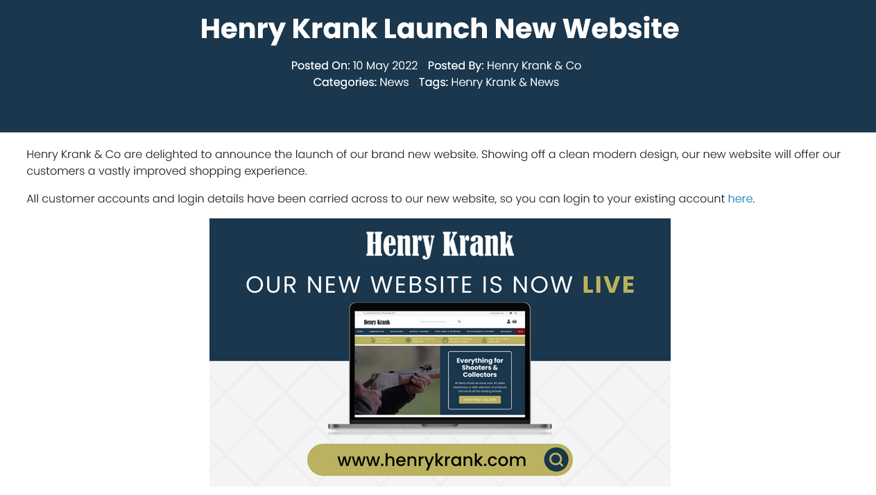
Me and my colleague spent the full day monitoring site performance and orders that were filtering through in an effort to identify anything untoward, but nothing aside from very minor issues (mostly graphical in nature) seemed to crop up.
While grateful for the smooth launch, the work never stops there. Before we knew it, I was back to work in identifying aspects that needed to be changed and/or added, as well as us all wasting no time in planning the next steps we were to take to expand user experience and functionality of our site.
Post Launch Support & Woes
Much like not only my time during the development phases, but also in a striking parallel to when I first joined the company, I was kept busy with fixing data migration related issues and having a personal vendetta against page elements that weren’t scaling down as precisely as I’d like in practice.
There will always be things, although hopefully small, that will be missed even during the most thorough testing phases. Many product issues will only come to light once customers have had a chance to get hands-on with your creation. As a result of this, we were able to get some feedback from new and regular customers alike concerning their experiences using the site. One customer had an isolated issue that broke their account page, another had a formatting problem that made certain elements unable to be clicked on their device and browser of choice, and a few had difficulties with our new checkout and basket systems.
We of course made sure to fix or escalate reported problems as they came in, when you no longer have the luxury of making changes to a demo site and are instead working with a live copy, having a balance between care and speed of issue resolution is a must.
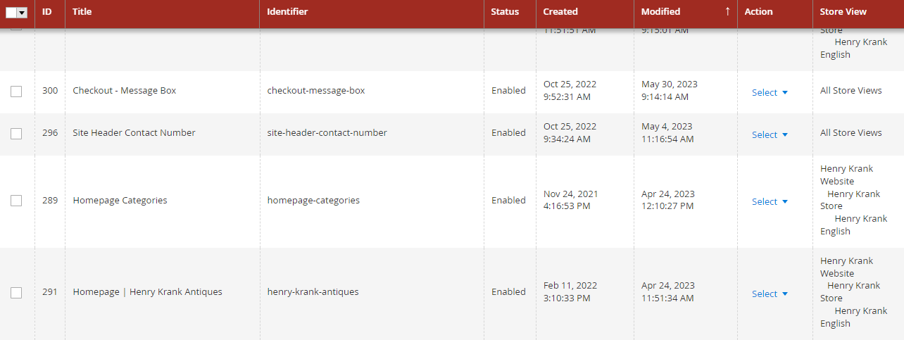
But it wasn’t just customer requests and problems that we had to concern ourselves with. With our old website, we had a lot more flexibility out of the box in terms of being able to make edits and additions to certain key pages. For example, I would frequently make changes to the homepage (such as changing theming during Black Friday) and add new elements myself where we felt appropriate. Our new Magento 2 website was far more locked down from an administrative perspective, meaning we were having to send unforseen requests to Piranha for thing we would previously have handled ourselves in-house.
This was something that we could only have come to realise once we started working with the site and its data as we usually would have done outside of a test environment. Because of this, we had to commission some more relatively involved development work in order to convert some elements of the website that were coded as static blocks into one we could edit and manipulate as we saw fit instead.
Post launch also saw the addition and extensive configuration of multiple plug-ins, including a particularly gruelling stint in setting up the many rules which now enable our smarter and more dynamic related products functionality to work, this was another one of those tasks that were conceived in the initial planning phases but were only able to be implemented and subsequently completed months after site launch.
Eventually, even the pressing (and not so pressing) post launch tasks were squared away neatly, giving the team some much earned breathing room and respite. We had a site that performed and looked better than anything we’d previously had, and we had also finally gotten the administrative/management side of everything to our liking behind the scenes as well.
But much like your average British soap opera, it just never ends. While the site is up, functional, and has been ticking along nicely for a fair while now, the list of features that we were unable to implement in the initial stages continues to loom. A list that has only been added to as time has gone on, because with a project like this, you’re never truly done.
Moving Forward
So where does that leave us today? The website team at Henry Krank is not one content to sit idly by, this means we have a multitude of new and existing projects at various stages of planning and development, including one particularly large project that we were quoted and subsequently paid for right at the start of the project before we’d even drafted our first designs. This particular task is under wraps at this point, but will likely delight a specific subset of our customers by making their purchasing experience much more convenient.
As with any business participating heavily in the digital space, future business needs, a changing technology landscape, and a desire for flexibility and modularity are all things that must be continually assessed and worked upon, in order to stay ahead of the curve and meet the ever changing shopping and browsing demands of the modern day customer. I have no doubt that things will continue in this manner at Henry Krank, as I’ve seen first hand and participated in the vigour in which such challenges are embraced, tackled, and ultimately conquered.
I’ve attempted to include as much detail in this post as possible about all of the planning and steps that went into this massive project, but the fact of the matter is that so many smaller details can fall between the cracks that you wouldn’t always pick up on until you’re neck deep in all the kinds of work and communication that comes with such an involved task.
If you have any questions regarding the content of this article, or anything else you may find on this site, please contact me at maxingham@duck.com.